MENGNIU DAIRIES — CAUSEWAY BAY, HONG KONG
Taking an EV powerhouse to the global stage
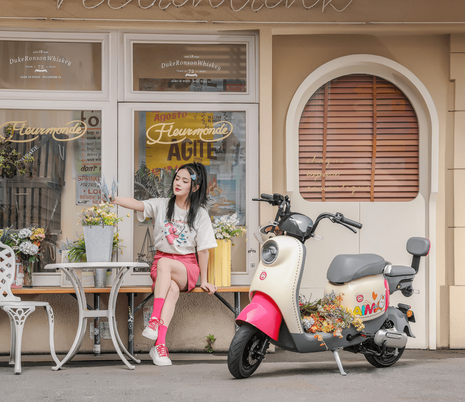
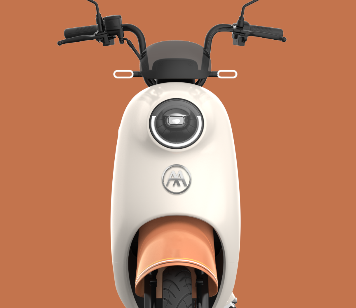
With some 10,000 retail outlets in China, AIMA Technology required a more balanced and harmonious design aesthetic for their brand. The company appeals to young people seeking mobility and their innovative transport solutions offer an enticing pathway to purchase. Strong local competition meant that brand dominance was a key challenge the brand refresh sought to achieve.
— Create a harmonious and elegant work mark
— Achieve balance and clarity
— Enhance brand recall opportunities
— Build a brand system that appeals to the young generation


Where fashion and technology collide
The team thoroughly explored the existing market landscape both within the Chinese economy and beyond to the US and Europe. By identifying key areas of visual opportunity, Rob was able to present a variety of strong assertions about the design direction which would best achieve the goals of AIMA management.
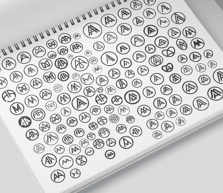
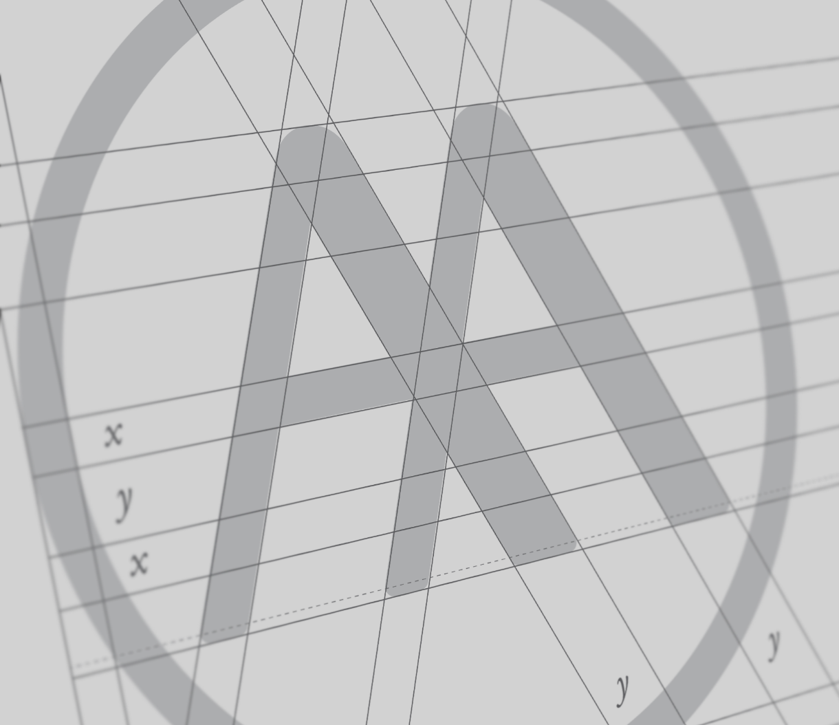
Design studies eventually focused on the symbology of the double AA motif that AIMA had developed over time. Additional refinement and balance was gradually uncovered.

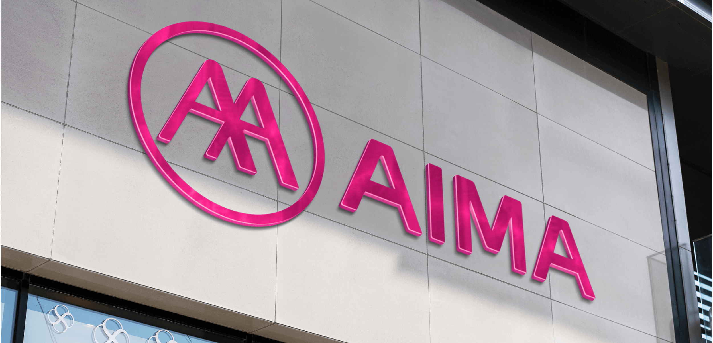
Designing a complimentary logo mark
Upon approval by the client, launch marketing and branding work began. A comprehensive style guide was prepared to optimise the value from the newly conceived logo. By ensuring consistency with each contemporary application of the branding the corporate emblem came to life as it became the figurehead of every communication piece. This work continues…