

ANTICANCER BIOSCIENCE — CHENGDU, CHINA
Creating a brand that really matters
Anticancer Bioscience is located in the technology hub of Chengdu. It is an exciting international precision oncology company applying synthetic lethal approaches to develop targeted cancer therapies. Its methods bring both eastern and western medicine together to create some of the world’s most advanced treatments. While its operations are based in China, it has laboratories in the USA, Australia, England and India, ensuring the brightest minds in the world can collaborate.
Anticancer Bio Science approached Rob Janoff Studio to bring a sense of life to a subject that can seem all business. The company is highly passionate about what they do and how it can potentially improve lives. The brand needed to be recognisable and feature a very human essence.


Where western and eastern medicine collide
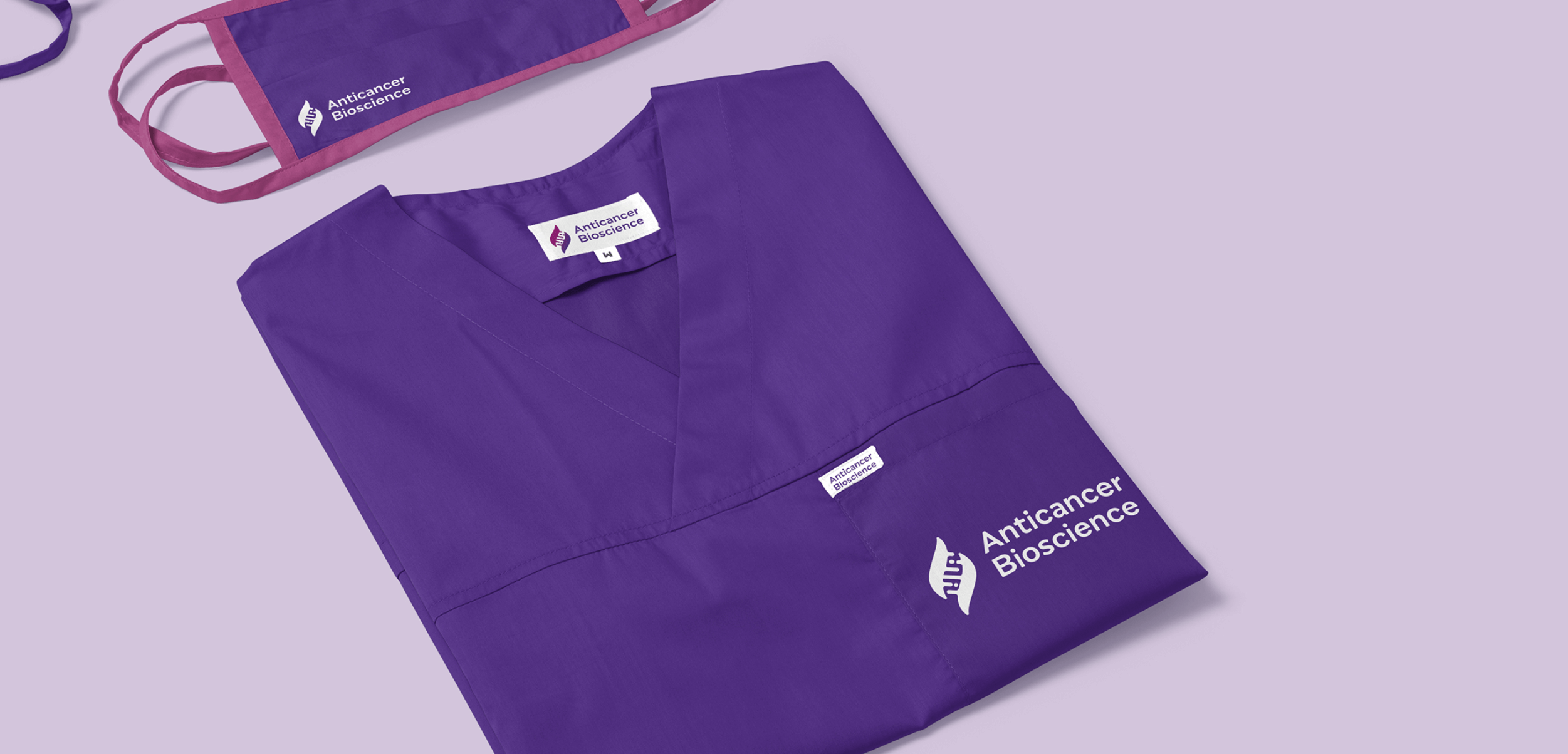
The logo mark resembles two leaf-like shapes connecting via DNA. These two sides represent the Eastern and Western medicines working together. A purple palette was applied to the brand to give it precise visual positioning in its market. The logo mark needed to be simple and efficiently utilised in full-colour or one-colour. Their industry peers generated a very positive response to the brand as it presents a visual mission statement in something so simple.
The soft flowing lines, rounded edges and clear typography all add to the mission of being a highly approachable brand.


Illustration that brings a human touch
A key part of the visual elements for the Anticancer Bioscience brand is illustration. Detailed medical photography can be confusing for many audiences and the goal was to share a hive of life and activity at a cellular level. Vibrant colors, pattern and shape add a layer of texture to the brand presented in a very caring and human manner.