

LUCAS — LONDON, ENGLAND
Lucas, UK’s largest commercial finishing company rebrand
Lucus is a family business now run by one of Britain’s high profile corporate leaders and humanitarian, Danny Lucas. Working with some of Europes largest names such as McClaren, Emirates, Sky and the London Olympic Games, Lucas is required to be as agile as it’s clients. Lucas came to Rob initially seeking an identity that help would propel the business into its imminent bright future. A successful corporate rebrand and multiple subsidiary brands later Janoff & Partners has been able to assist in placing Lucas is an advantageous position.


A geometric identity that connects with customers
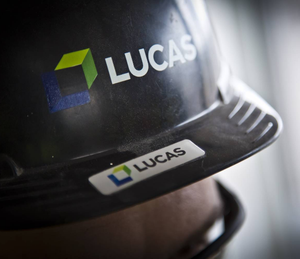
The build of the new Lucas brand had to come from a place where their future customers could identify a strong sense of identity, a presence of attention to detail and brand voice of clarity and consistency. As most clients of Lucas are in construction it made sense to build a geometric shape to bridge a connection point. The ‘L’ from Lucas always was to be an anchor point, to promote pride within from a multi-generational company. The final resolve demonstrates an abstract of from with sharp edges promoting that desired sense of detail and finishing.

The geometric shapes connecting demonstrate how Lucas integrates to help clients finish the project. The supergraphic shows reflect the different services working together to build something of great value.


Simple, identifiable and progressive
The Lucas rebrand is now in full flight and taking advantage of the quickly accrued brand recognition. Rob wants the logo to last generations and carry the simple yet powerful storytelling of how Lucas makes spaces better. A box sits at the center of the logo mark, signifying ‘space’; the arrow at the top looks to the company’s future success and the clients it services.
