APPLE COMPUTERS — SILICON VALLEY, CALIFORNIA
Designing the world famous Apple logo
At the time of his initial meeting with Steve Jobs in early 1977, Apple Computer was still very much in its infancy, having been incorporated for less than a year. Apple’s offices were in a local strip mall, and consisted of just the three partners – Steve Jobs, Steve Wozniak and Mike Markkula.
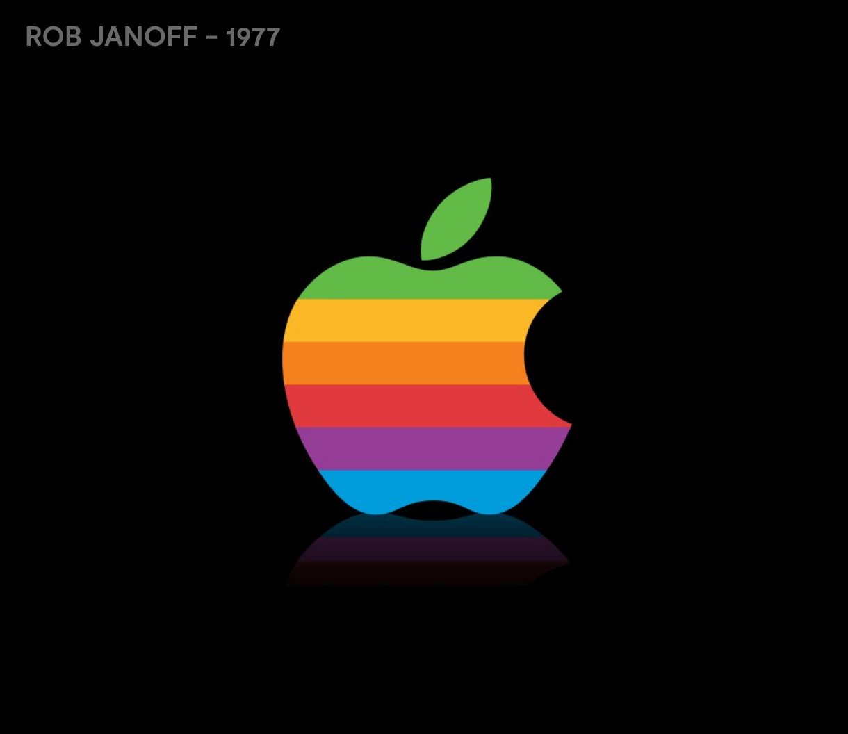
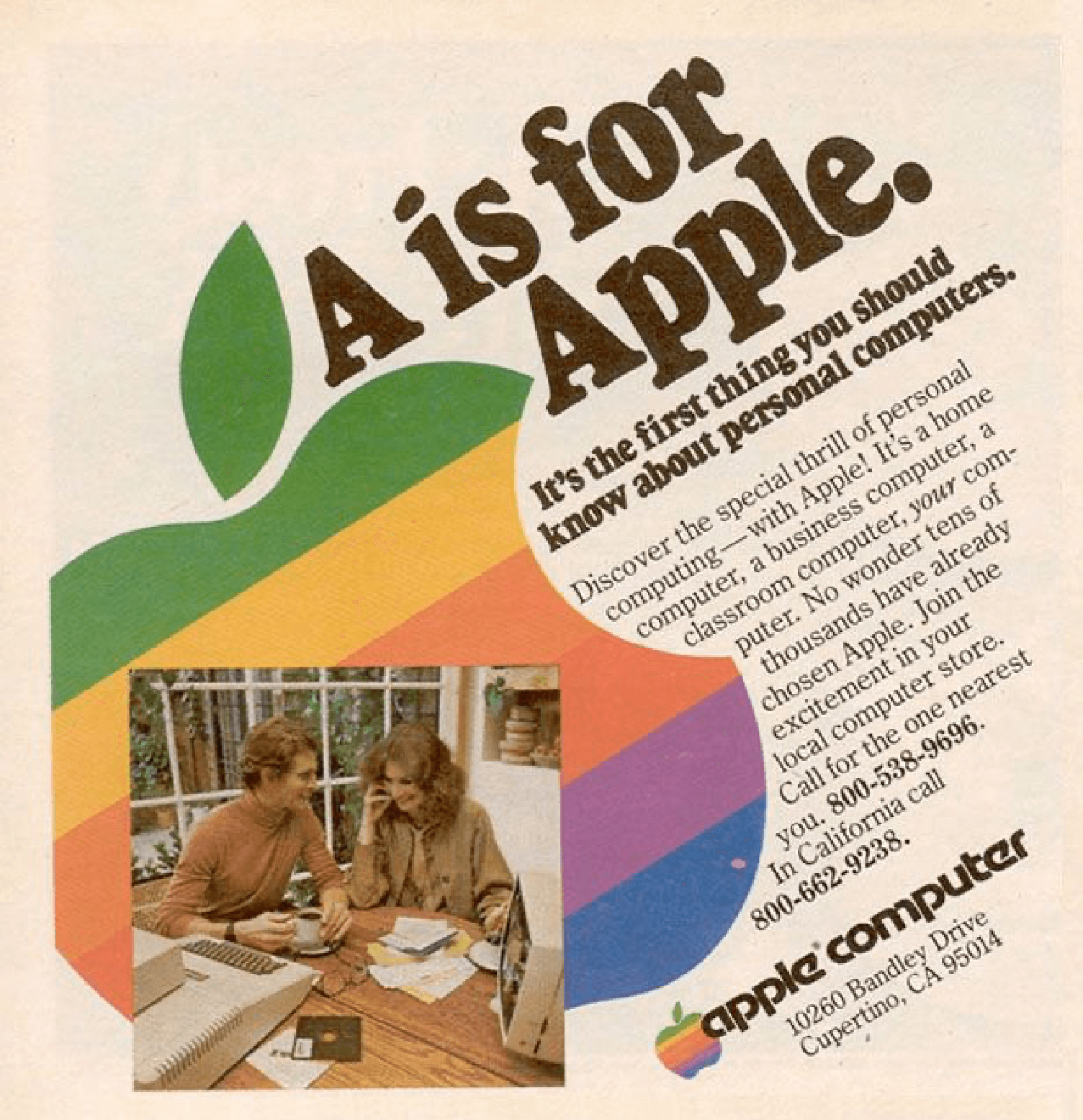
The initial identity development was to coincide with the introduction of the brand’s first personal computer, the Apple II. The entire design process with the upstart client only took about two weeks. After the agency’s initial meeting, Rob Janoff went to work developing the Apple icon based on his examination of physical cross-sections of real apples. The design study basically amounted to Rob endlessly drawing Apples until he was happy the shape was iconic. The man who first drew the Apple logo then added stripes to indicate the Apple II’s capacity to display colour, something noteworthy for the time.
While there are a lot of claims and counter-claims about the logo and related mythology, Rob Janoff offers more pragmatic observations about how and why he drew the Apple logo in these reputable articles: CNN, Forbes, SMH
Thinking different requires designing different
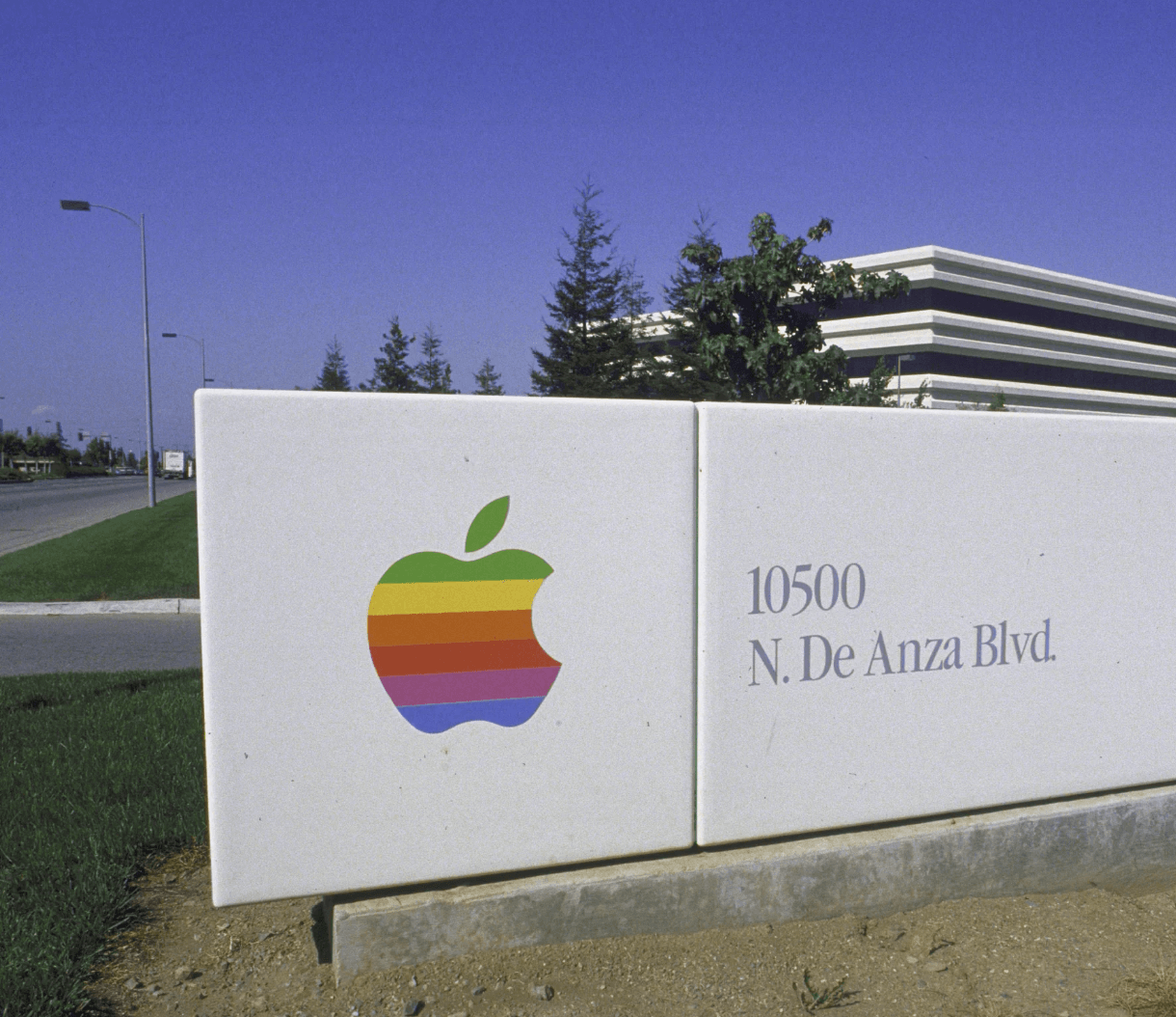
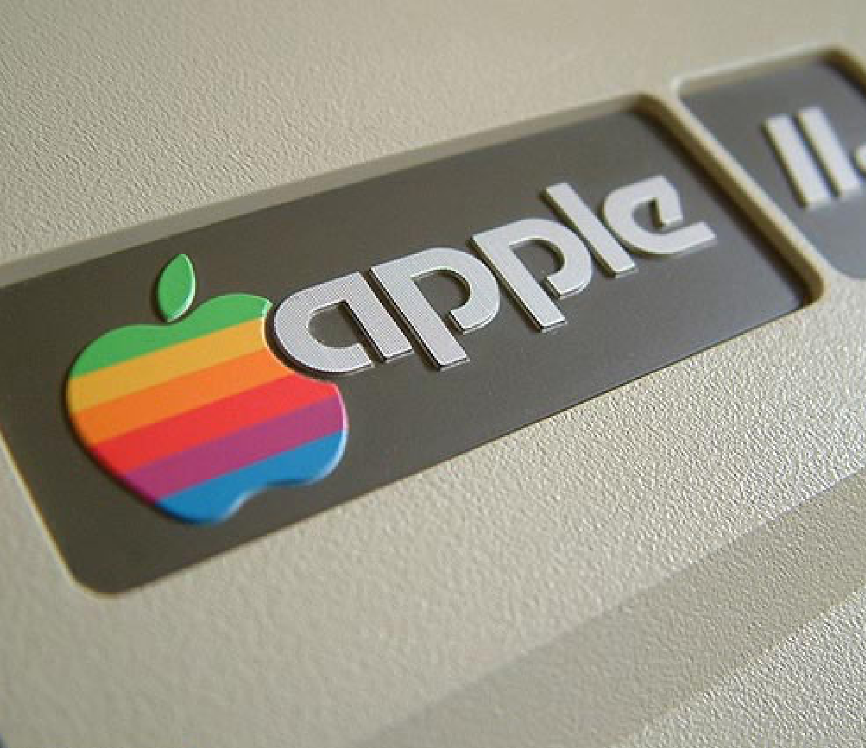
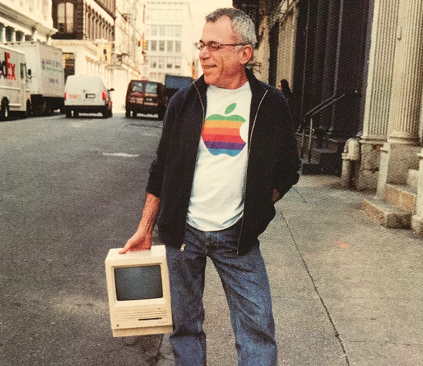
The design with its multi-colored stripes was promptly approved for production by Steve Jobs. Production artwork was then developed for print ads, signage hardware emblems and software labels on cassette tapes, all in preparation for the launch of the Apple II in April of 1977 at the West Coast Computer Fair. For the next 20 years, the now famous “rainbow version” logo adorned all Apple products from its computer products to the Newton PDA. The only concept ever presented to Apple was an immediate success!
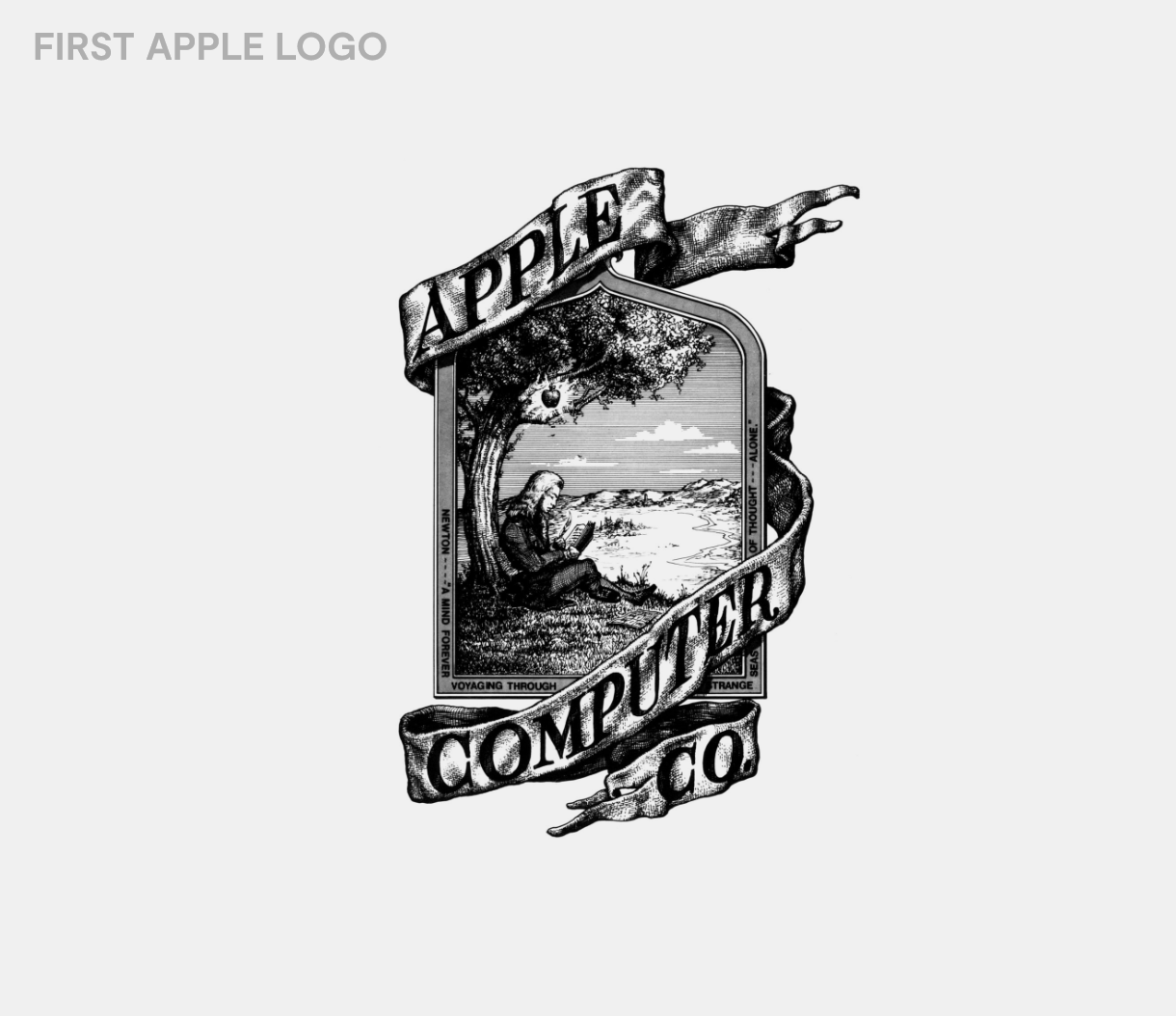
The brief was not to design a logo, instead Rob knew the market needed something human and welcoming. At the time computers were not in peoples homes and Rob helped turn something scary into something desirable.
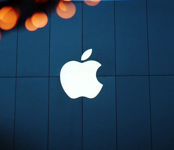
The world’s most recognisable logo
No one could have known at the time that Rob was designing the most famous logo to ever exist. In saying that, Rob carefully understood the market and created something truly revolutionary and a make that would last generations. This simple symbol carries with so much meaning and says so much without any words.